 janetwo
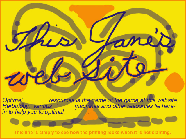
Here is the first effort at solving the problem of why most web sites are ugly. Besides breaking all the rules of good composition carefully learned at art school, there is in particular the problem of why the text looks so bad, as it does in this example. I think it is because the text seems oblivious to its relationship to the graphic. It often lies above it, is of a different color, is rigid, tight, unjoyful - whereas the rest of the site often attempts to be the opposite. Yet verbal info is usually the most important part of a site.

